hOp · Shipped 2020
Accessibility
Branding
Design System
Documentation
Startup
Workshop Facilitation

Project overview
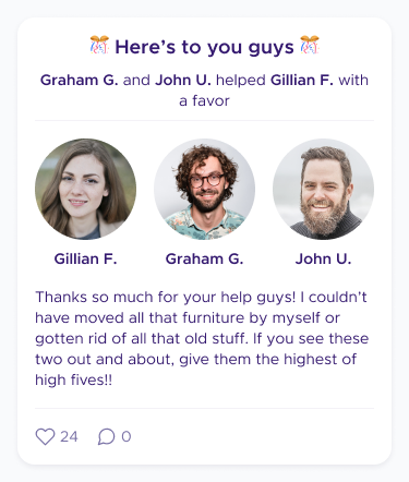
hOp was an Austin-based startup that offered "community-as-a-service" in the form of private social networks for multifamily residences. Residents could talk to each other, share photos, ask for favors, list items for sale, communicate with property managers, track packages, and more through a dedicated app. hOp customers could manage their communities through a desktop dashboard.
hOp's user base grew dramatically during the pandemic, intensifying many longstanding UX issues. To build a more stable foundation for future growth, hOp undertook a full redesign of its mobile app. But the three-person design team lacked a clear, shared foundation for colors, spacing, interactions, and UI patterns. Engineers also lacked reliable documentation, creating extra churn. Without a centralized source of truth, we were unlikely to meet our ambitious launch date.
I was asked to build a design system lightweight enough to keep us moving on our active redesign but structured enough to guide designers and engineers through rapid decision-making. Because nearly every workflow in the app was being re-imagined, the system had to flex and evolve in real time as we made changes to navigation, hierarchy, and other core UX patterns.
We hit our October launch deadline, shipping a redesigned mobile app built on our new design language. I led a company-wide branding exercise to create alignment the new look-and-feel, reducing churn on visual design choices later on. For the first time, designers had a shared vocabulary and reusable patterns that let them move through new screens without reinventing the wheel. And engineers had reliable documentation throughout. Lunch & Learns and working sessions kept the company aligned as the system expanded.
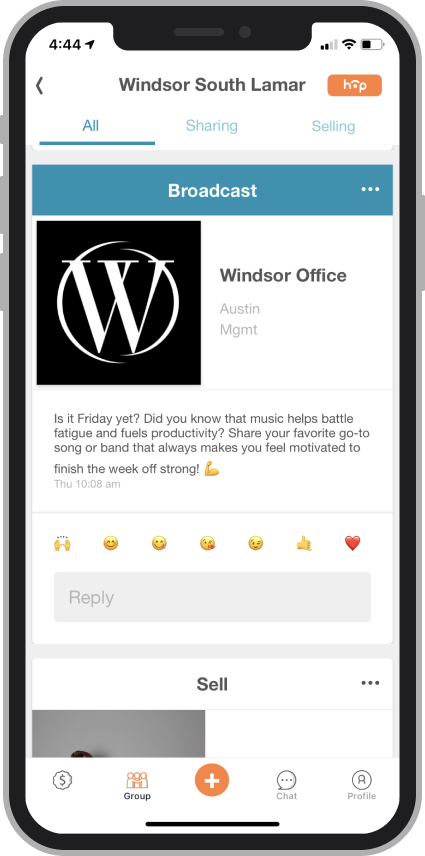
Above, screenshots from hOp's mobile app before the redesign. The engineering team had used base Flutter components to quickly get into production, with little time to consider hierarchy, color, and spacing rhythms.
Constraints
Since we were starting from scratch, the design team quickly aligned on a basic framework for grids, spacing, and colors that we could later flesh out as use cases and visual language became clearer. There were also a few guidelines I had to keep in mind as I built the design system:
Speed mattered. I prioritized building the right primitives fast, rather than creating the perfect components. Early momentum helped us define and test use cases. This allowed the system to support an active redesign without falling behind.
Instead of treating accessibility as a box to check later, I evaluated contrast, states, and legibility as I built. This prevented inconsistencies from creeping in and ensured all components had a strong baseline of usability before they showed up on any screens.
hOp communities include members, admins, and other roles. Components needed to reflect these permission levels, not just visually but at the UX level. This meant designing variants that accounted for what an admin sees vs. what a member sees in workflows like posting, reporting, and moderating.
As the system evolved, I kept designers, engineers, and marketers aligned through regular share-outs, documentation updates, and Lunch & Learns. This ensured the system was understood, trusted, and consistently applied, which was crucial for hitting our tight launch deadline.
Design language
Early on, it became clear that different teams held different ideas about hOp’s brand: some emphasized trust and privacy; others prioritized playfulness, spontaneity, or helpfulness. Without alignment, any visual language would feel unstable. To bring clarity, I created a company-wide branding survey combining quantitative value spectrums with open-ended prompts. The qualitative responses and the rationale behind them surfaced deeper assumptions about the brand and helped reveal how different teams interpreted hOp’s mission.
I then facilitated a cross-functional workshop with Design and Marketing to synthesize the insights. We narrowed nine initial themes down to six core characteristics that became the north star for the system’s visual language. This alignment made downstream decisions around typography, color, iconography, and motion significantly more grounded and cohesive.
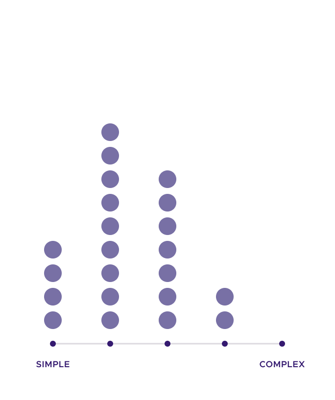
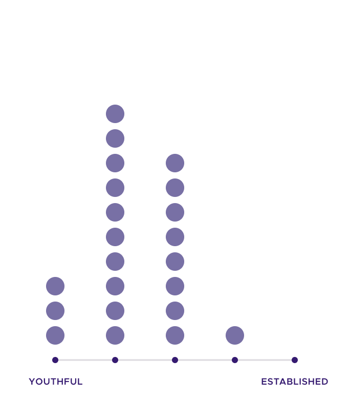
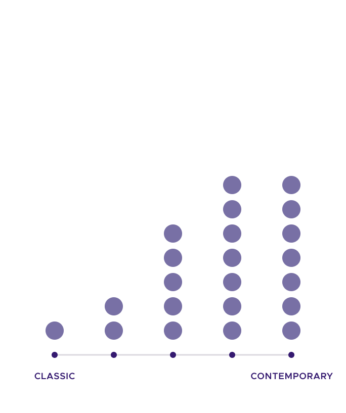
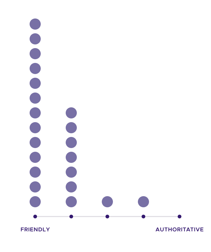

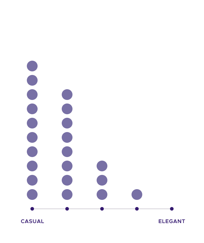
Above, the survey asked respondents to place the company in a spectrum of two values. In general, employees saw hOp as friendly, playful, casual, and youthful. Responses to other value pairs were more mixed.
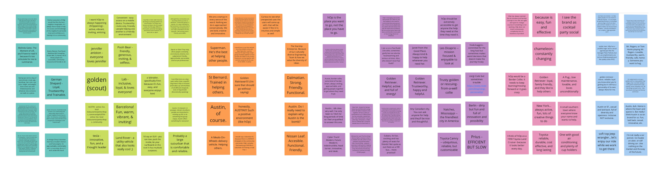
Above, utterances taken from the survey's open ended questions, color-coded for team and organized according to respondent and question. One example questions was "If hOp were a fictional character, who would it be and why?" Being able to read the respondents' rationale greatly helped us interpret these results in our branding workshop.
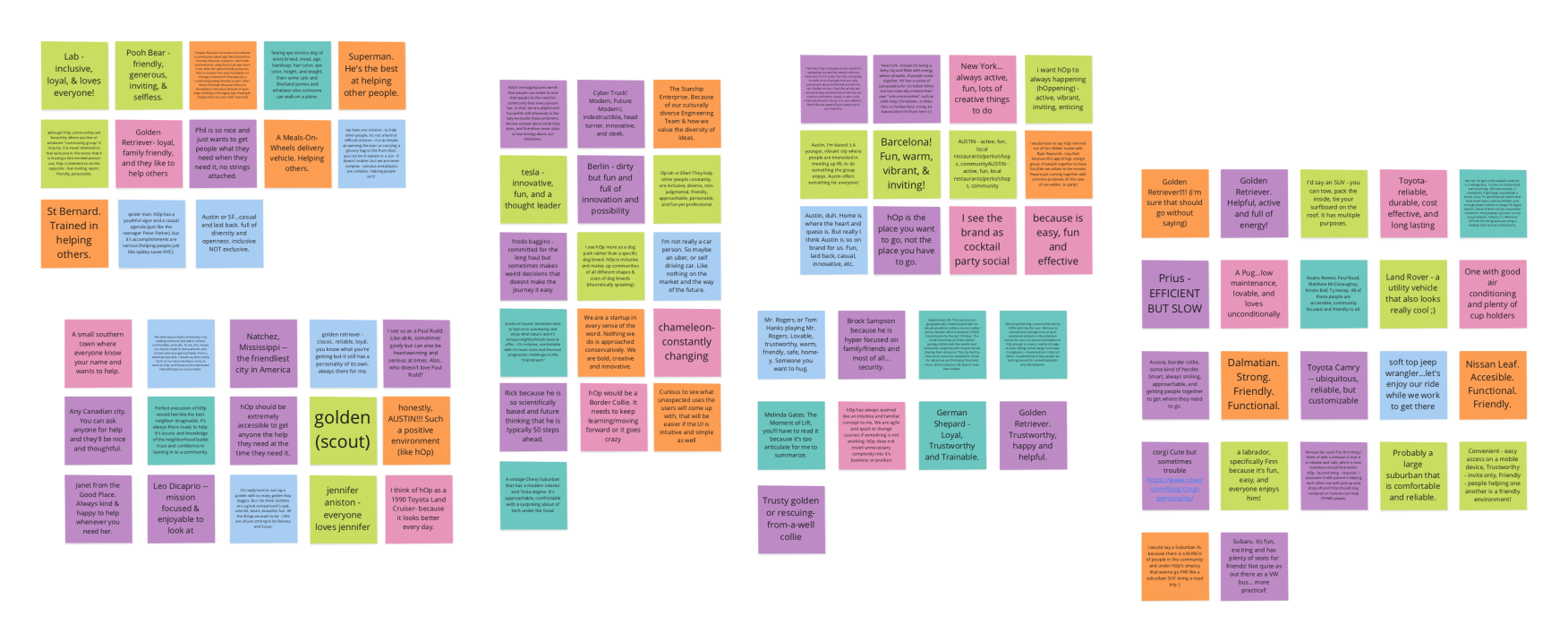
Above, an affinity map based on the responses received, and spent most of the workshop teasing out what each cluster was getting at. We started with 9 and consolidated down to 6. The color-coding also helped us see where teams were over- or under-represented.
Above, our first distilled set of design documentation based on the branding workshop. They covered colors, layouts, spacing, and grids. These would go through many more rounds of refinement as we expanded the system to cover more and more contexts and use cases.
Styles
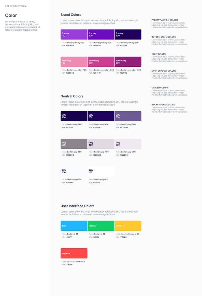
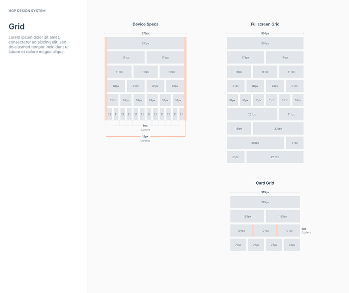
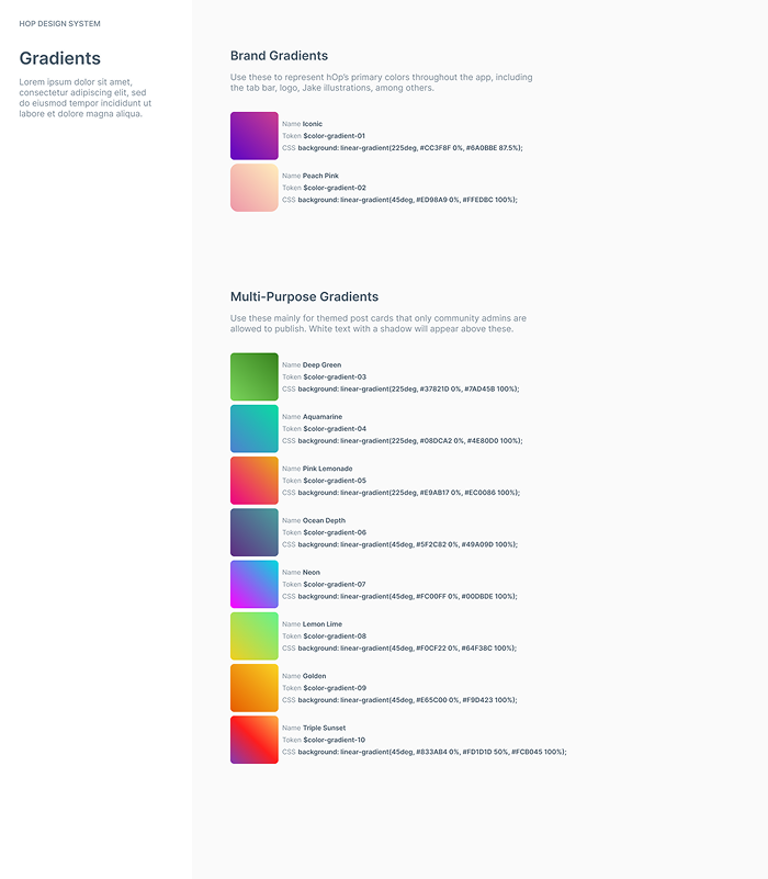
Drawing from the branding workshop, I established the core visual foundations: color ramps, type scales, grids, shadows, borders, gradients, and standard device chrome for iOS and Android. I added tokens wherever possible so developers could reference values directly and adjust them easily later on.
Given the absence of a visual-design budget, I sourced accessible, friendly, free-to-use sans-serifs (Metropolis was an early standout) and selected Feather icons as our primary icon family. This base system created cohesion across the redesign and reduced one-off decision-making for both designers and engineers.

Purple and Pink were the basis of the hOp brand, with Pink being the default action color. For these and other colors, I assigned each color and shade a token for easier reference later and checked for contrast and accessibility.
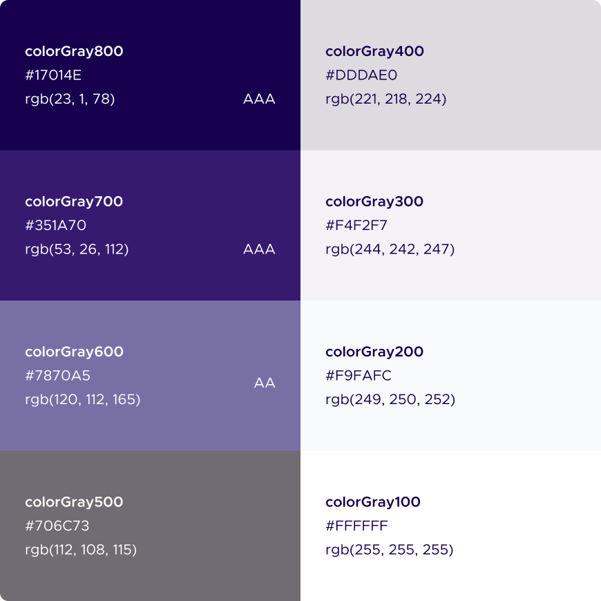
I included a range of "Gray" colors to use for text, backgrounds, borders, dividers, shadows and more. I also set up a range of gradient colors to use for themed cards and more. I included more shades than we had clear use cases for extra flexibility.

I looked for approachable, legible, and free-to-use sans-serif typefaces — Metropolis was an early favorite.

For most use cases, we used Feather's icon set. Our tab bar and perks categories were two use cases where we did not.
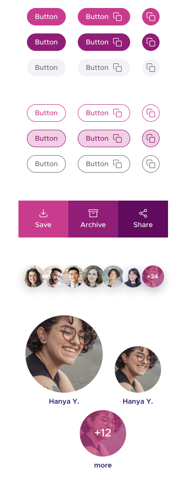
Components
Components were self-contained combinations of type, icons, and UI elements such as buttons, bylines, and comments. Using Figma’s variants, I built out different “flavors” to support multiple contexts: main feed vs. detail screens, admin-specific vs. member-specific views, and more. These variants allowed designers and engineers to quickly explore states and behaviors without rebuilding UI from scratch.
These components formed the reusable building blocks that made it possible to design new screens rapidly while maintaining visual and behavioral consistency.

Patterns
Patterns combined components into functional units like post cards with photos, reactions, and comments to create reusable chunks of content. These helped designers move quickly through flows and gave engineers clear, stable blueprints to work from.
Patterns were especially useful in the redesign, where many workflows were being rethought simultaneously. Building them early helped ensure alignment between design, engineering, and product as new decisions surfaced.
Screens
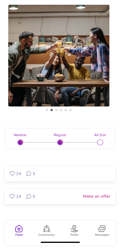
During handoff, screens brought styles, components, and patterns into cohesive experiences. The side-by-side before-and-afters highlight how the redesigned system improved hierarchy, clarity, and cohesion across the app. Because UX changes were happening alongside aesthetic ones, some screens also reflect broader product improvements made during the redesign.
Despite the intensity of the pace, the team hit our launch deadline — a direct result of having a system that kept design and engineering in lockstep, eliminated ambiguity, and accelerated decision-making.
Before
After
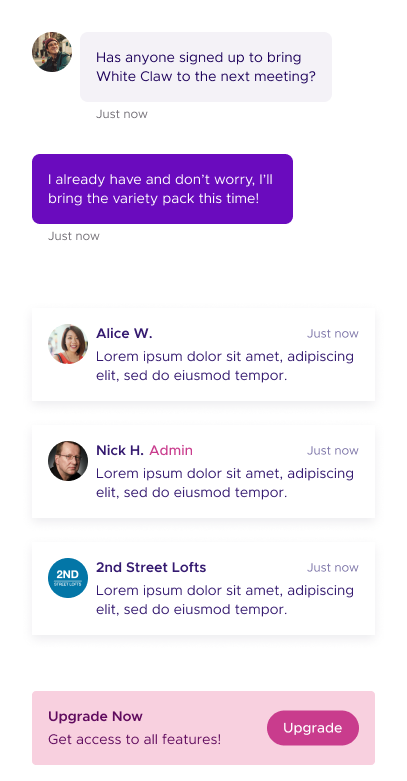
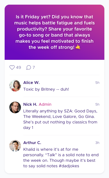
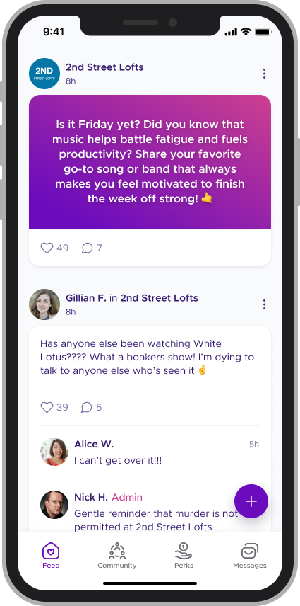
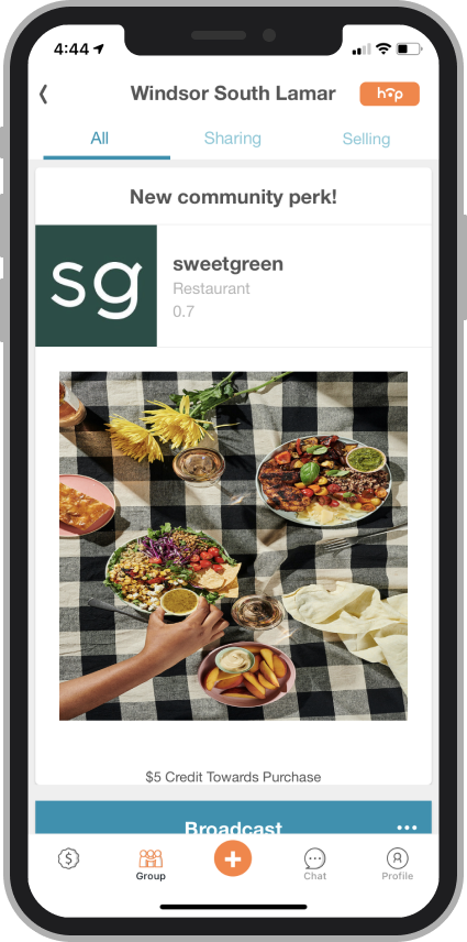
The redesigned app pulled back on the range of colors the app used, while simplifying content in the feed so more content would be visible within the user's viewport. Here, you can see how the redesign impact Community broadcasts, which only admins are able to send.
Before

After
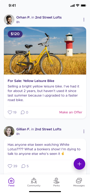
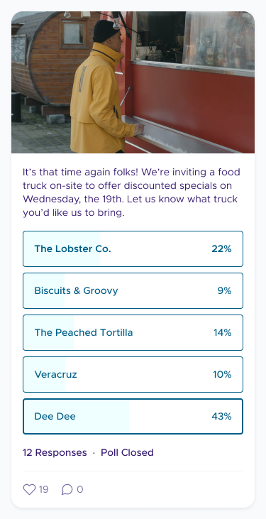
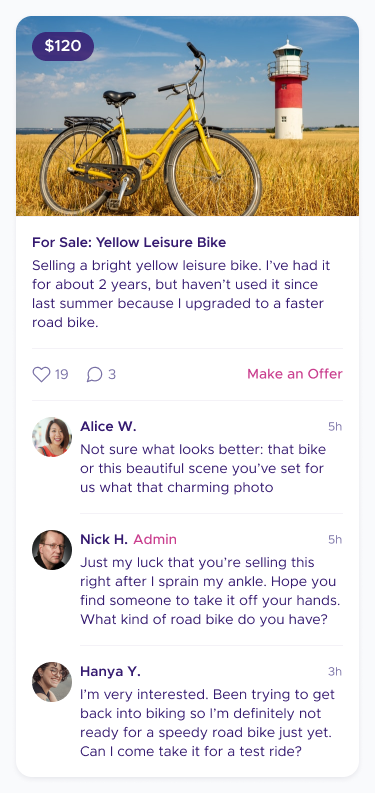
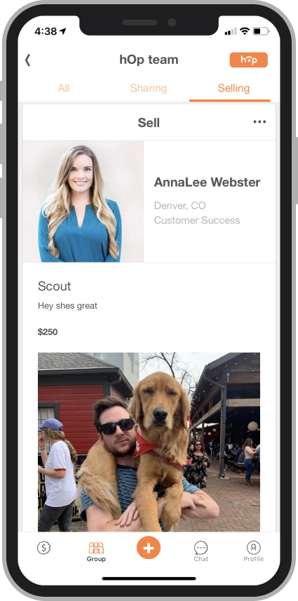
The redesign also included more streamlined "for sale" cards with an immediate and relevant CTA.
Throughout the feed, we also resized photography to better establish a sense of hierarchy.
Additional UX changes included moving the "Post" button out of the main nav to make it clearer which community a user's posting to; and removing any tab filtering.
Before
After
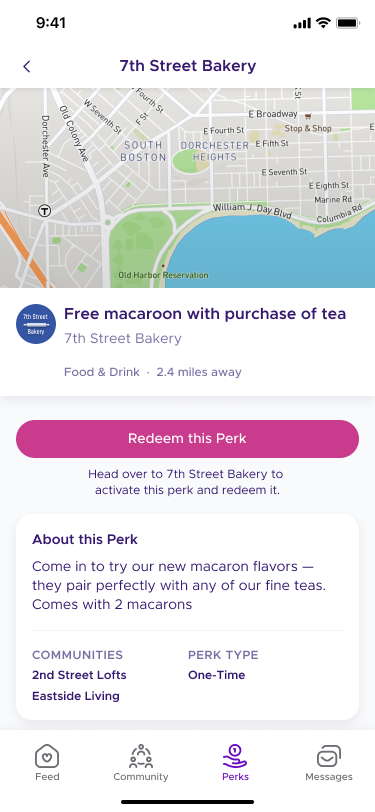
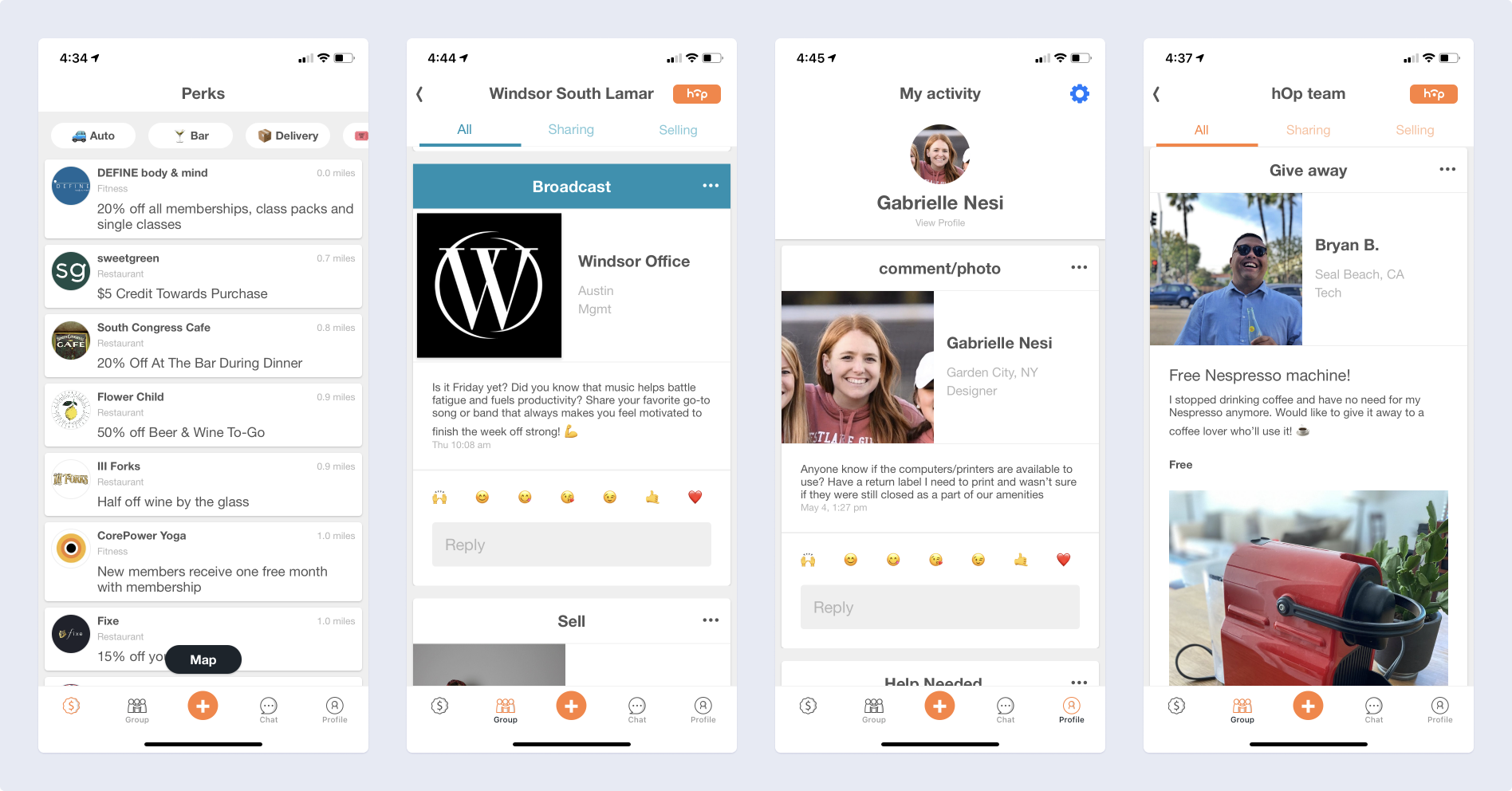
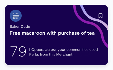
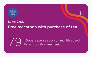
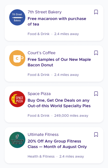
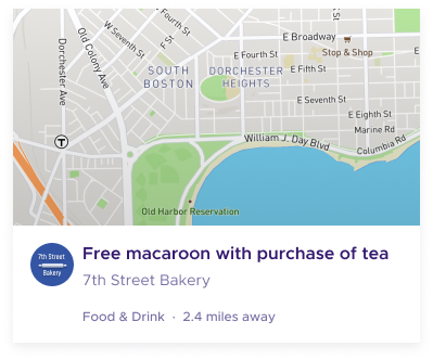
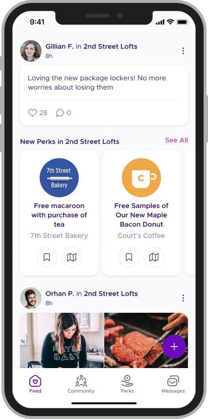
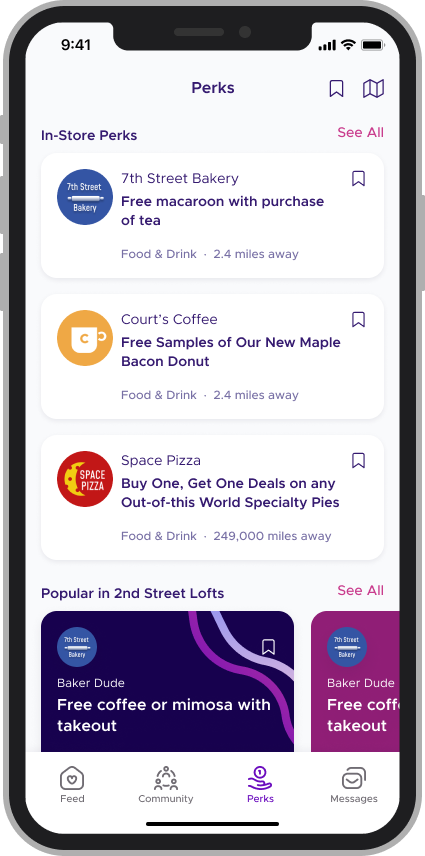
Perk cards were condensed into a carousel while still surfacing key actions like saving. Giving them a different shape made them stand out without being obtrusive. Merchant logos were still visible, but scaled more appropriately for the context. Merchant-provided graphics were hidden on the feed.
Before
After
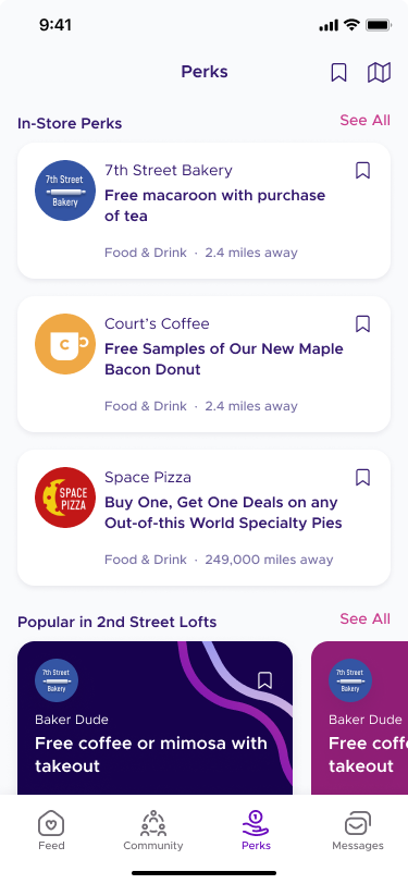
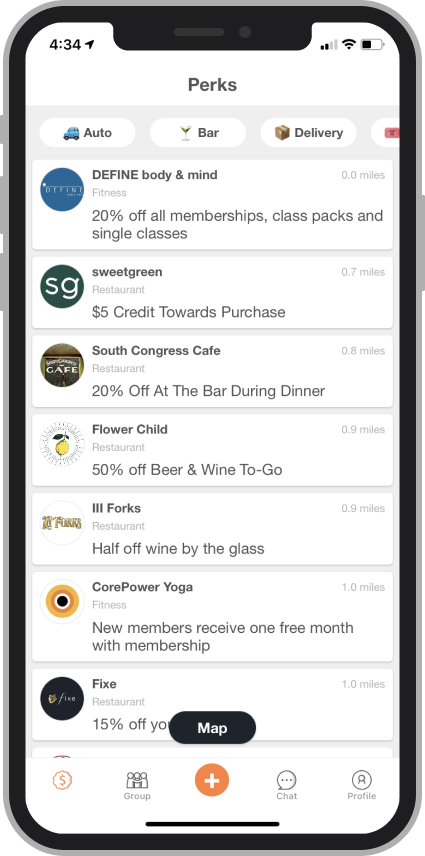
The Perks experience saw a lot of UX improvements. Our redesign focused on doing a better job of highlighting specific categories of Perks, while improving readability for everything else. We also broke up the long vertical "feed" of perks cards with horizontal carousels for featured or popular perks.

Before
After
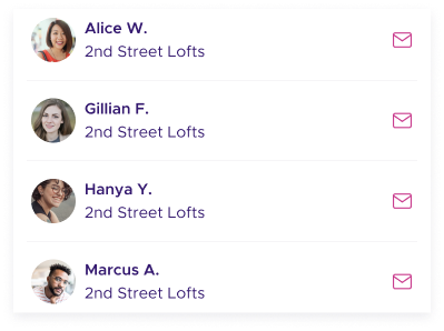
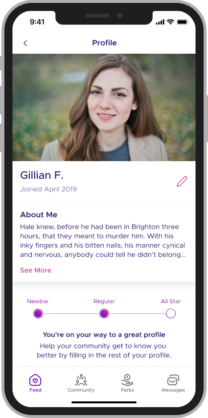
Profiles were moved out of the main navigation and simplified to only include one photo. New content was added to entice users to finish filling out their profile with extra, optional information.