hOp · Handed off 2021
Cross-platform
Data Viz
Design System
Desktop
Documentation
Startup
Project overview
hOp was an Austin-based startup offering private social networks for multifamily residences. Tenants used the mobile app to communicate, ask for favors, track packages, etc. hOp’s customers (typically property managers) relied on a web dashboard to manage membership and oversee community activity.
In October 2020, hOp launched a redesigned mobile app, widening an already large disparity between user and customer experiences. At a time when the company was aggressively marketing to prospective property managers (and competing with more modern solutions) the two surfaces no longer felt like parts of the same ecosystem. The dashboard also wasn’t equipped to support the increasingly data-heavy workflows our teams were beginning to explore.
I was asked to bring the dashboard into alignment with the redesigned mobile app and create a scalable system of desktop-friendly styles, components, and patterns. While I had room to make targeted, business-driven UX improvements, engineering resources were extremely limited, so the focus needed to remain on modernizing the UI rather introducing any complex interaction changes.
Using the mobile design system I had just built as a foundation, I created a desktop-specific layer of visual primitives: expanded color tokens, a new type scale, an updated grid and spacing system, and refreshed iconography. With that foundation, I designed a library of data-heavy components and defined the variants and states needed to support complex admin workflows. This enabled us to explore increasingly data-heavy workflows.
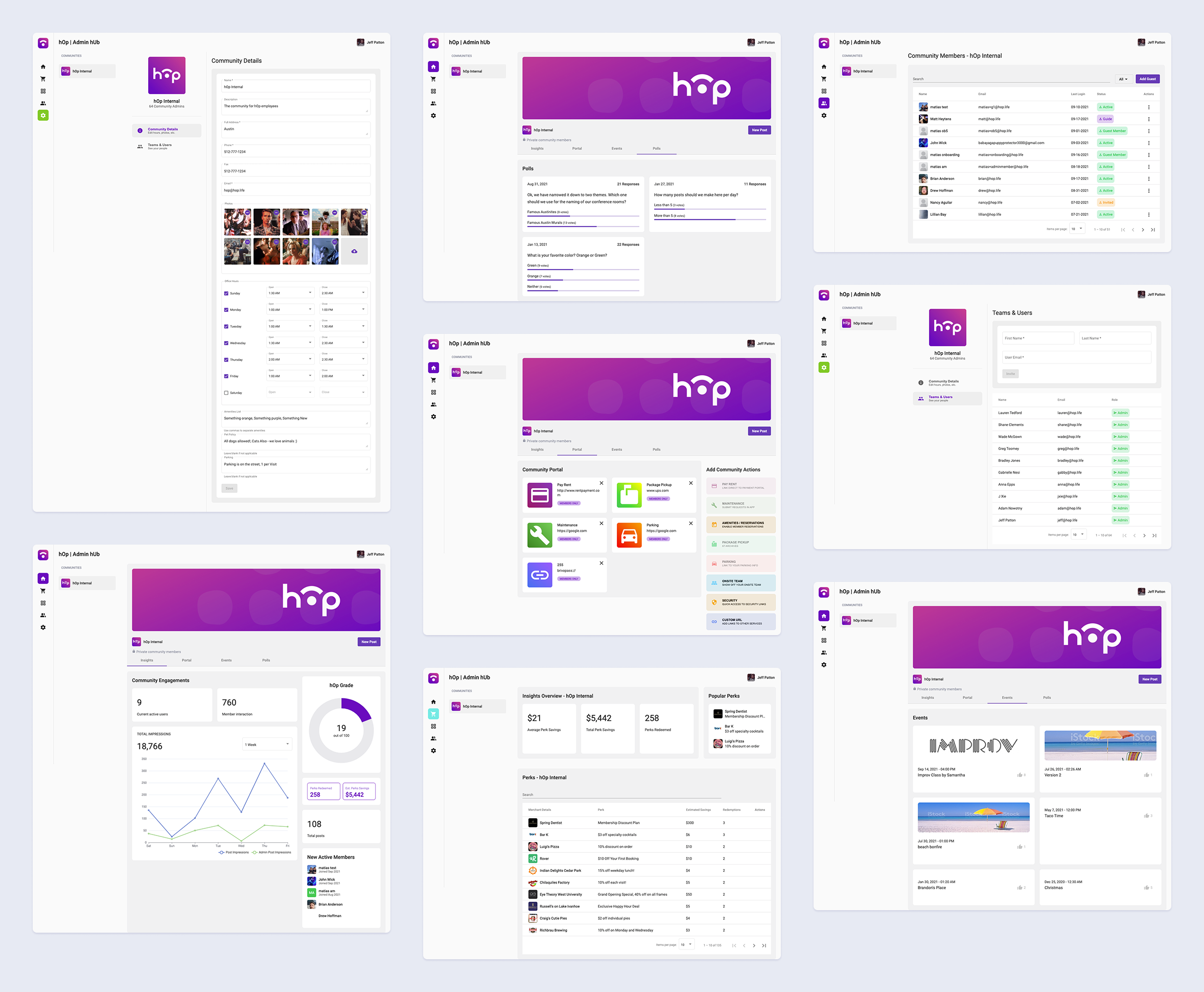
Above, the state of hOp's dashboard at the time the mobile app was relaunched.
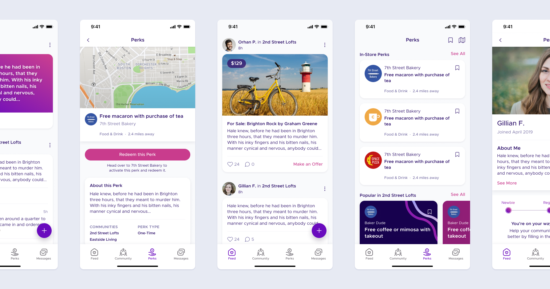
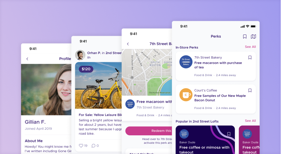
Above, hOp's new design language applied to its recently relaunched mobile app.
Constraints
Building a desktop system on top of an existing mobile foundation came with its own set of constraints and tradeoffs. A few principles guided my approach:
To create coherence across platforms, I anchored my design work to the mobile design system’s styles and tokens, then expanded and adapted them for desktop needs. This ensured both products felt like they belonged to the same family.
Engineering bandwidth was tight, so major interaction changes were off the table. Outside of a few opportunistic UX improvements like like relocating the community picker, I worked within the constraints of existing layouts and flows.
Instead of treating accessibility as a box to check later, I evaluated contrast, states, and legibility as I built. This prevented inconsistencies from creeping in and ensured all components had a strong baseline of usability before they showed up on any screens.
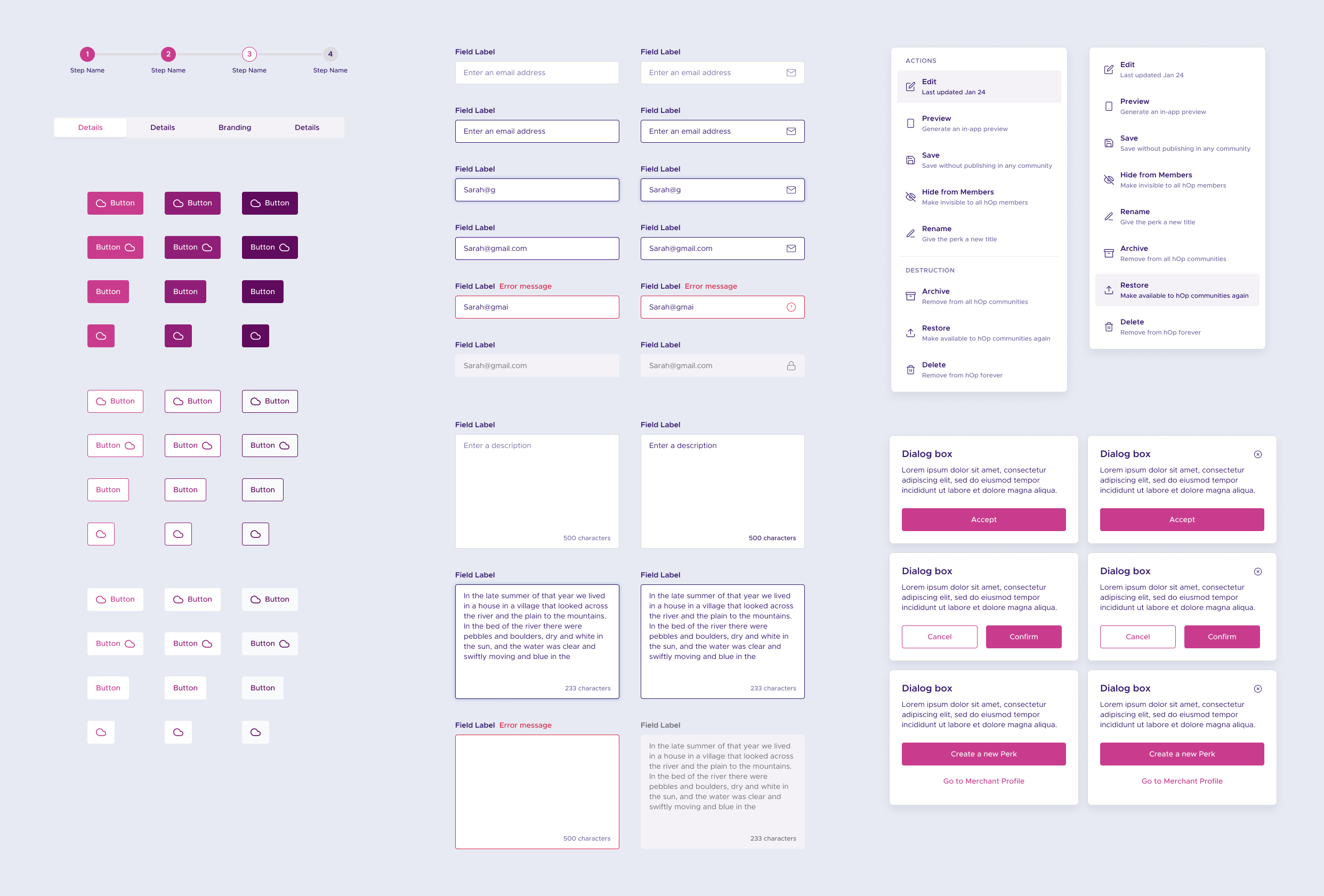
Variants were essential, but they easily got out of control. Once, a table component had 130+ variants, slowing Figma to a crawl. To improve performance, I distributed properties across layers of components and restructured how states were grouped.
Design audit
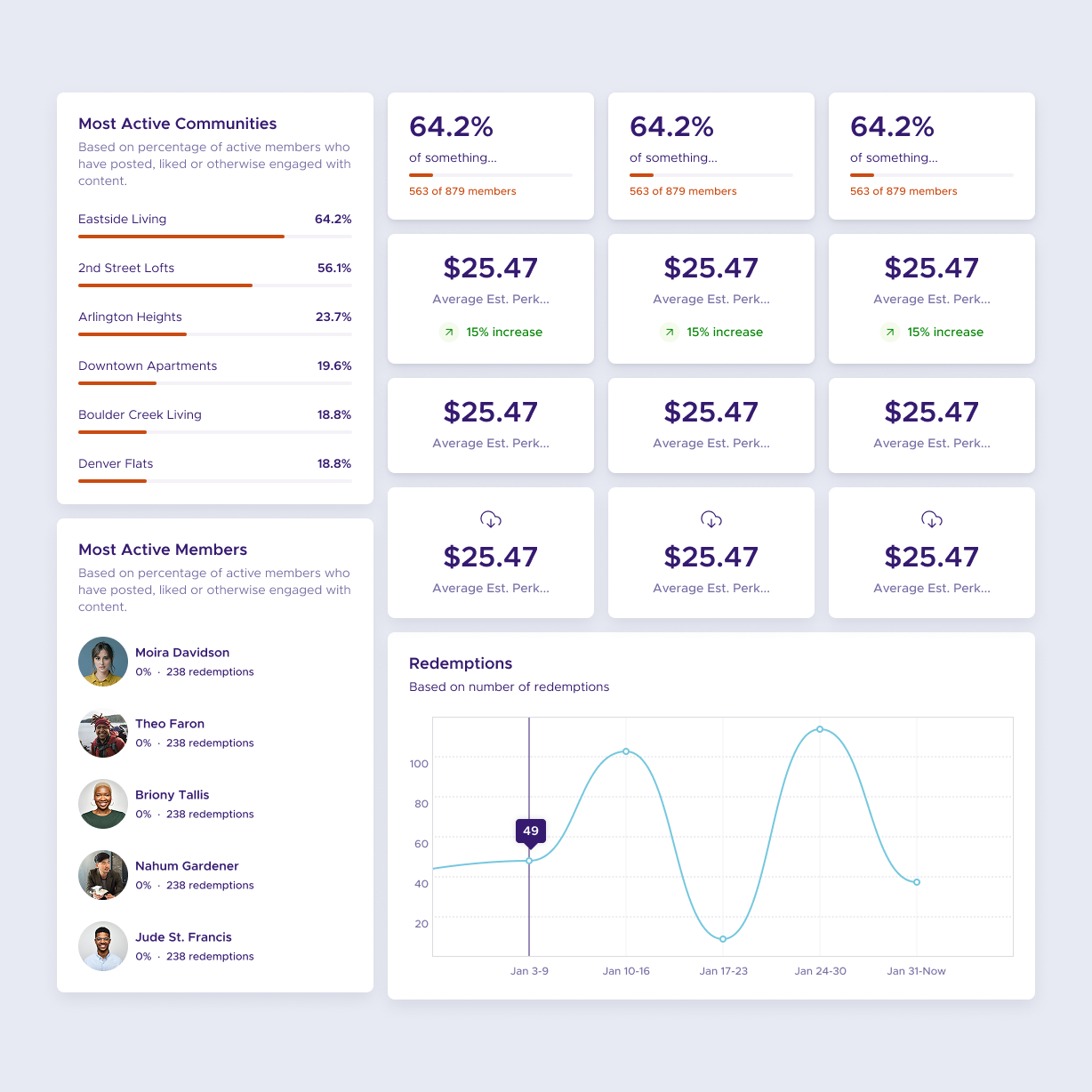
Unlike the user-facing mobile app, the dashboard needed to display dense datasets, support complex form interactions, and scale across a wide range of admin workflows. Early in the audit, it also became clear the system would require an expanded set of accent colors for data visualization and a more desktop-friendly type system.
The original dashboard was overloaded with inconsistent color and styles, most of which didn’t match what was in the mobile app. I stripped the visual language down to clearer, calmer primitives, prioritizing readability and reducing noise across tools that admins used daily.

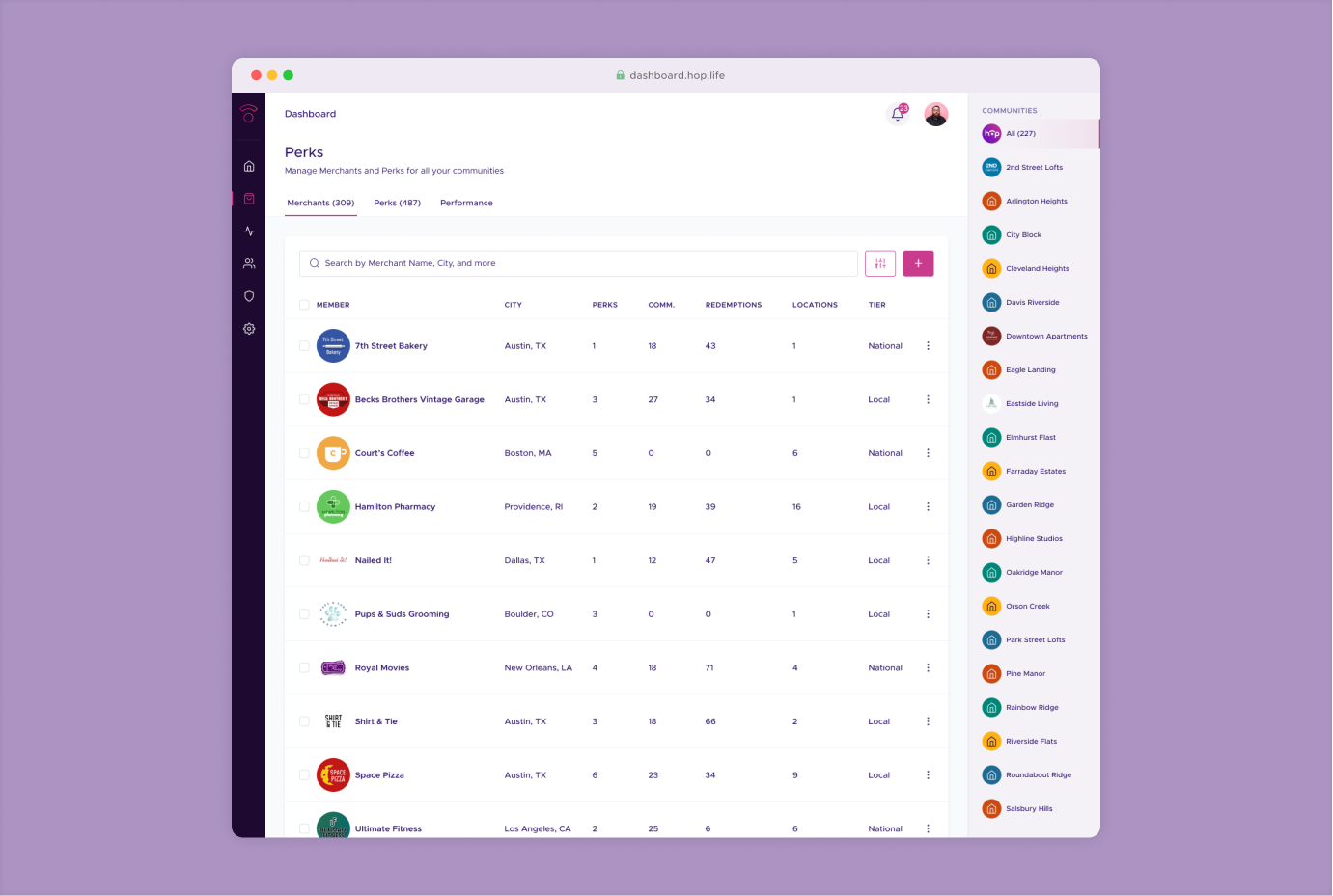
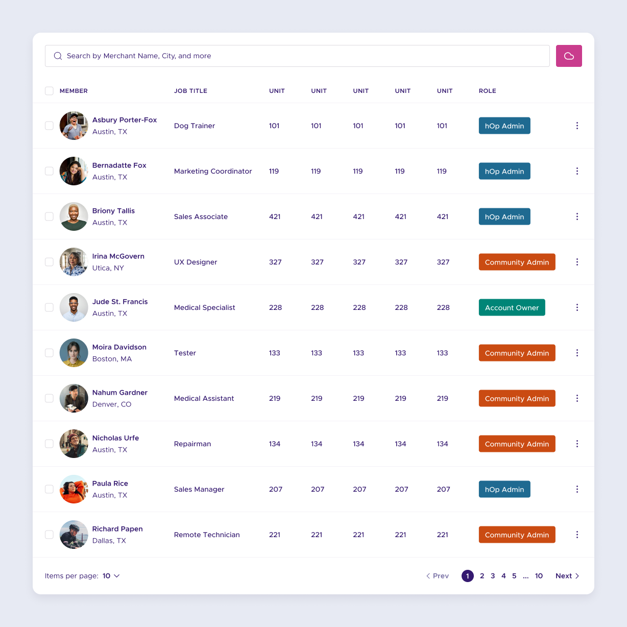
Tables were the backbone of the dashboard, from member directories to vendor lists. They needed to handle different row heights, optional search/forms, action buttons, and varied content density. My goal was to create a small set of flexible table building blocks that covered the full spectrum of use cases without becoming unwieldy.
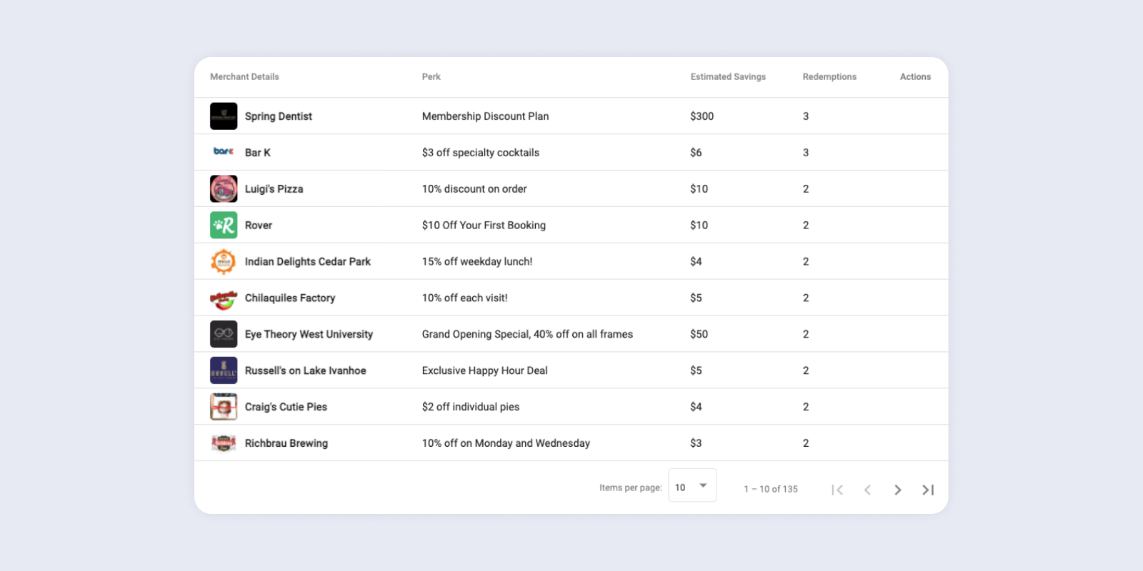
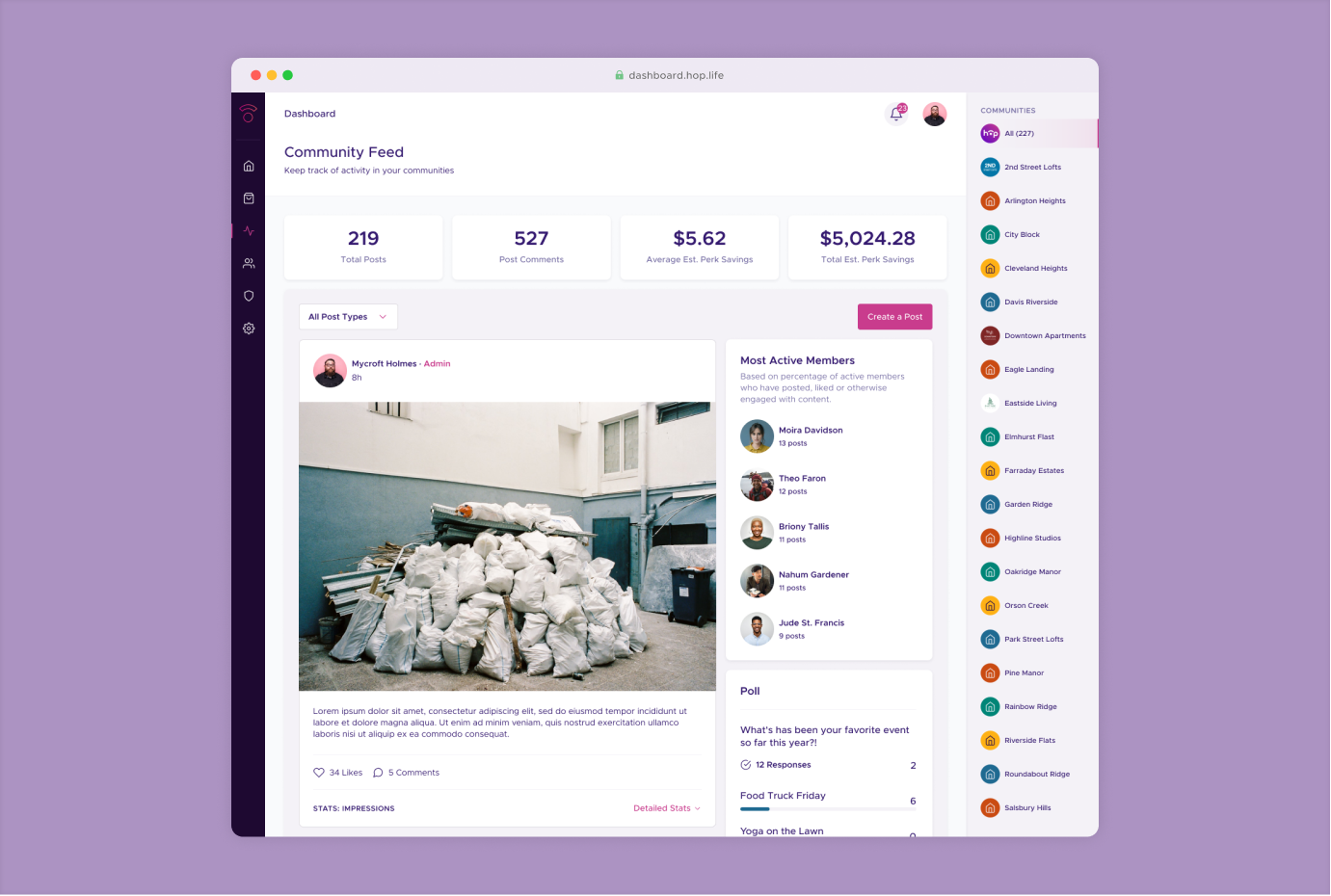
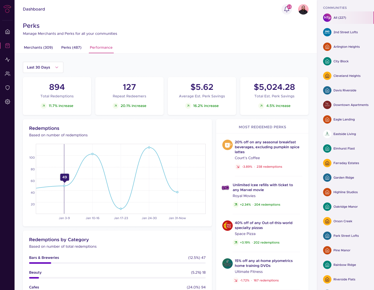
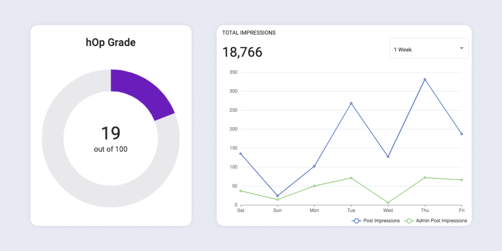
The dashboard supported multiple kinds of data: pie charts, bar charts, leaderboards, and community-level metrics. Building a consistent visual vocabulary for these elements became a core part of the system, starting with a wider range of color primitives.
UX Changes
Before my work began, the perks team had already been rethinking how perks were created, approved, and managed across communities. Perks were one of hOps biggest differentiators; users consistently cited them as a reason to join and stay active in their communities. Improving the perks management experience had clear business value. Even with limited engineering resources, it made sense to incorporate some UX refinements to would make perk management easier and more flexible for both community admins and internal teams.
Most admins only had access to one community, so the community picker didn’t need top-level visibility. Moving it to the right edge of the screen reduced visual competition with the main page and freed the header to act as lightweight secondary navigation when sections had multiple subsections, something that became especially important for the updated perks tools.

Relocating the community picker clarified the hierarchy and made space for tabs when sections, such as Perks, required a persistent secondary navigation bar.
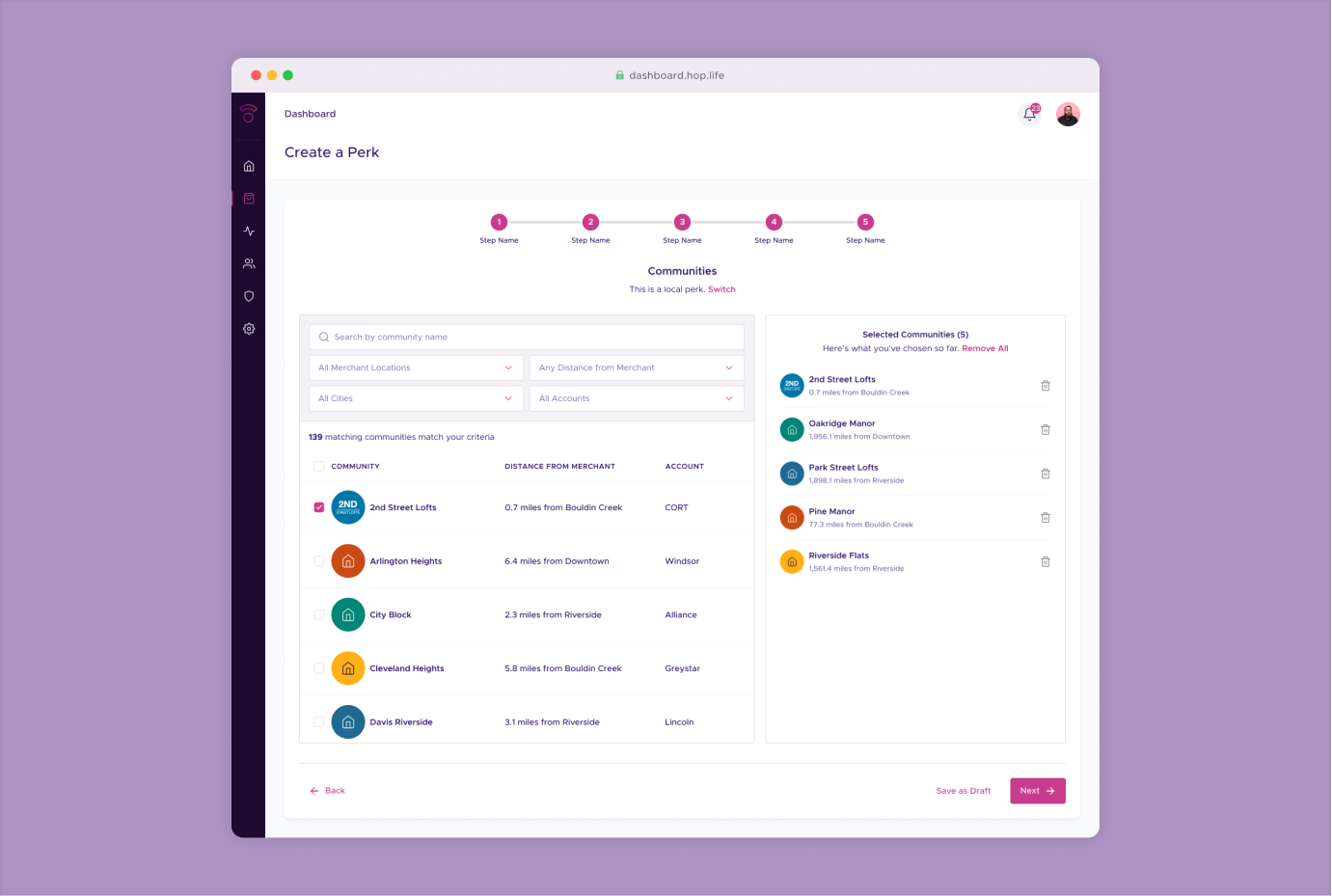
The new Perks workflows included multi-step tasks: drafting a perk, adding details, setting eligibility, and approving it for individual communities. To support this, I introduced a full-screen “focus mode” layout that removed the community picker and emphasized a single column of content. This reduced distractions and made long-form tasks feel more guided. I created two grid systems and matching component variants so teams could switch from the standard dashboard layout to this focused layout without resizing every table, form, and module manually.

In the full-screen layout, the community picker disappears and components switch to single-column variants, making multi-step workflows like creating a new perk easier to complete.
Design language
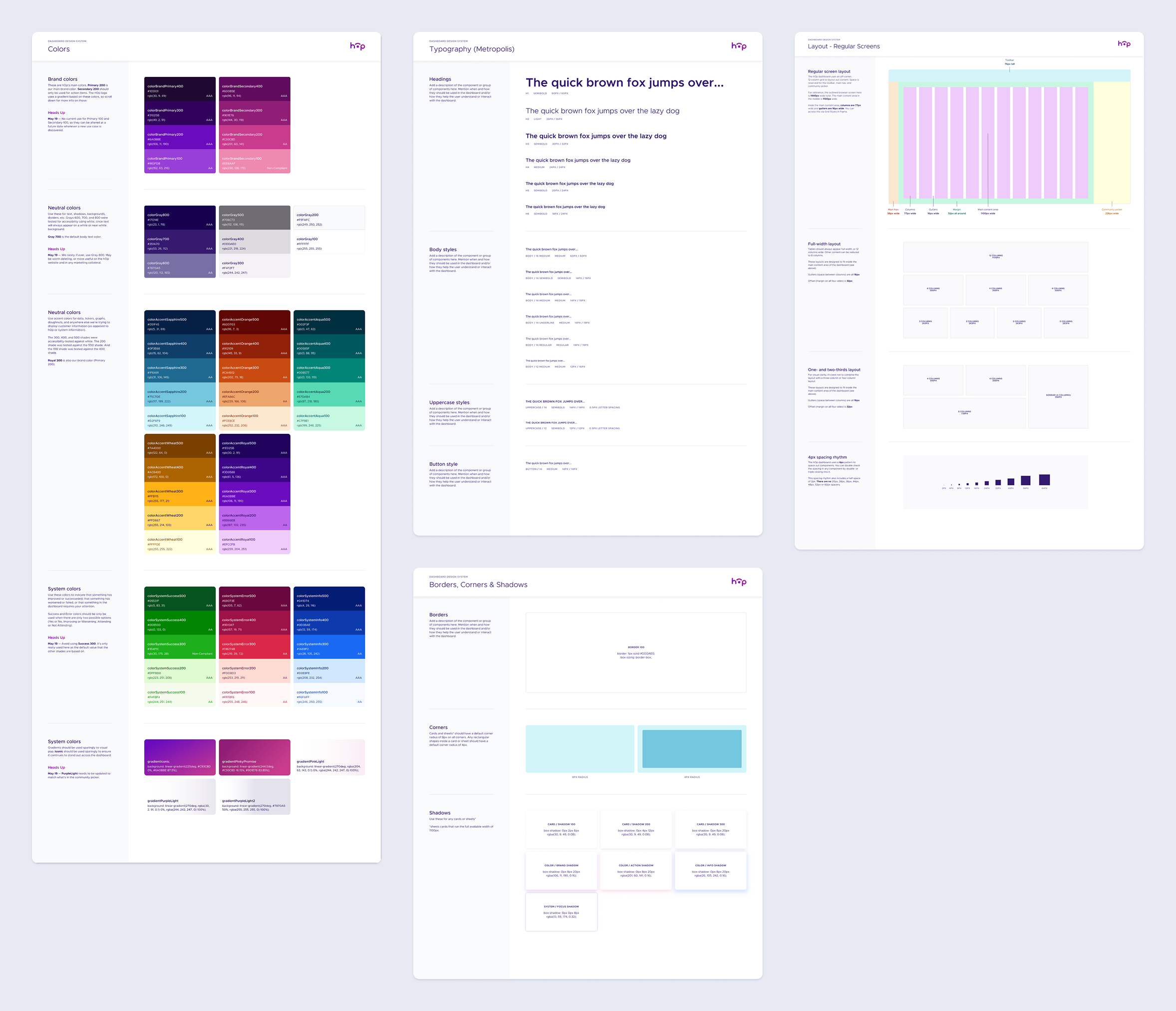
The mobile design system gave me a strong starting point, but the dashboard required a visual architecture built specifically for desktop: denser information, multi-column layouts, and more complex interaction patterns. I redefined the foundational styles to suit these needs, developing an expanded set of accent colors optimized for data visualization; a desktop type scale with tighter hierarchy control; and a grid system optimized for wide viewports and response layouts.
I also updated iconography and refined the core token sets of colors, radii, borders, and shadows to ensure components behaved consistently across screens with varying content density. This layer established the primitives that every component and pattern in the system depended on.These components formed the reusable building blocks that made it possible to design new screens rapidly while maintaining visual and behavioral consistency.
Components and patterns
Patterns captured recurring structures unique to specific parts of the dashboard: post cards in the Activity tab, perk creation flows, directory layouts, and more. Unlike components, which were defined by what they were, patterns were defined by where they appeared. Each pattern combined multiple components into a predictable structure with consistent spacing, hierarchy, and interaction rules.
This approach allowed designers to assemble new screens quickly while preserving system logic, and ensured that domain-specific workflows—especially perk creation—remained coherent as the product evolved.
Screens
Screens represented the top layer of the system, where styles, components, and patterns converged into fully realized product surfaces. These included community directories, vendor tools, activity feeds, and perk management workflows. By composing screens from reusable system primitives rather than bespoke layouts, we reduced design overhead, improved cohesion across the product, and made future extension far more efficient.